Create an Instagram Aesthetic: A Guide to Grid Layout & Branding
Chloe Davis
July 16, 2025
Chloe Davis
July 16, 2025
Aesthetics & Branding
•
6 minutes read
Got a fantastic product but an Instagram feed that looks like a chaotic garage sale? The colors clash, the photo quality is all over the place, and there’s zero clear story.
Congratulations, you’ve just perfected the art of confusing potential customers right before they ghost you.
If your profile isn't converting, it's because your brand's identity is a hot mess. This guide is your intervention. We're going to transform that disconnected presence into a powerful, cohesive brand asset. By defining and executing a unique instagram aesthetic, you’ll attract the right audience, instantly show them what you're about, and drive actual business growth.
Let's be clear: your instagram visual strategy directly impacts your follower growth and success. For many potential customers, your Instagram profile is the new homepage.
It’s the first thing they see, and a strong, cohesive instagram aesthetic makes a powerful first impression in seconds. When visitors immediately get what your brand is about, they're far more likely to hit 'Follow'.
Interestingly, while a polished look is important, it's not the only thing that matters. Data shows that smaller accounts (under 10k followers) often have higher engagement rates than massive ones. This tells us that authenticity and connection can be even more powerful than a perfectly polished feed. Think of your aesthetic as the firm handshake, but genuine connection is what builds the relationship.
Consistency in your instagram visual content is what builds brand recognition. A unique aesthetic ensures your content is instantly identifiable in a crowded feed. Your followers will recognize your posts on sight, strengthening your instagram branding and making you memorable.
Before anyone even taps on a single post, your aesthetic communicates who you are and what makes you special.
It builds trust without a single word.

Before you even think about picking filters or a color palette, you need to translate your core brand identity into a visual strategy. This is the non-negotiable groundwork that makes sure your instagram aesthetic is authentic and actually says something valuable.
Get this right, and your brand's aesthetic practically builds itself. A clothing store for influencers in downtown LA and a flower shop in rural Vermont are speaking to two completely different worlds.
Don't just guess. Knowing your audience is critical because consumers with an emotional connection to a brand spend over 300% more than those who don't. Your goal is to create instagram visual content that resonates so deeply with your ideal customer that they feel like you get them.
To get specific, ask yourself:
List your top 3-5 brand values. Are you all about sustainability, innovation, community, or craftsmanship? These aren't just fluffy words for your website's about page; they are your content directors.
A hiking gear company that values nature won’t just post pretty mountain pictures. They’ll show you the recycled materials, the earthy tones of their products, and the ethical sourcing behind the scenes. These values should bleed into your color choices, content, and even your text posts.
This is where you define your content pillars—the 3-5 core themes you’ll consistently talk about. For that hiking gear company, the pillars might be:
These pillars ensure your values aren't just abstract ideas; they become a reliable content schedule that your audience can count on.
Your brand’s personality sets the entire mood for your feed. You need to decide where you live on the spectrum:
Are you casual and fun? Cool and minimal? Do you write captions like you're talking to a friend, or do you keep it formal and composed? This “vibe” dictates your visuals, your caption style, your language, and yes, even your emoji game.
Just make sure the vibe you choose vibes with a full shopping cart, not an empty one.
Alright, you’ve done the strategic soul-searching. Now it’s time to build the toolkit of visual elements that brings your brand's instagram aesthetic to life.
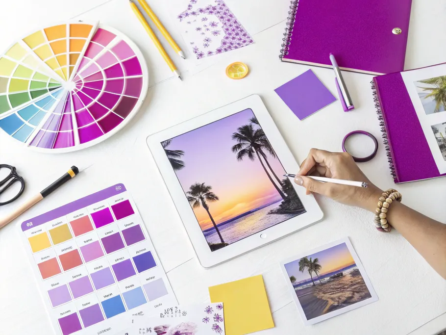
Let’s be blunt: color is probably the most critical piece of your visual puzzle. About 85% of buying decisions are based on color, and getting it right can boost brand recognition by a whopping 80%.
If your business already has a website or logo, don't reinvent the wheel. Adapt those colors for Instagram. The key is subtlety – think a consistent tone or color family, not a paint-by-numbers repeat of your logo in every post.
This is your creative sandbox. If you sell bathing suits, pin everything that feels right – beaches, sunsets, tropical drinks. Soon, you'll see a color story emerging from the chaos.
Pick six or fewer colors and commit. This is your holy grail for all

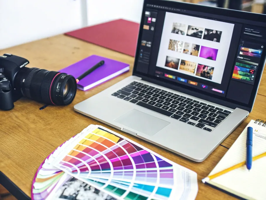
To create a cohesive instagram aesthetic, you need a consistent editing style. Stop flip-flopping between dark, moody photos and light, airy ones. You’re giving your followers visual whiplash.
To get that cohesive look, just pick a filter and stick to it. Nothing screams “authentic” like a perfectly consistent, pre-packaged lie.
Jokes aside, the easiest way to ensure consistency is by editing your photos with presets. These are just pre-designed filters you can apply in apps like Adobe Lightroom. They save a ton of time and guarantee a uniform look across all your images. Find a style that matches your brand's vibe, and you're golden.
Having the right visual elements is only half the battle. Strategically arranging them on your instagram grid layout is what creates that professional, compelling, and cohesive look that stops the scroll.
Okay, you've picked your colors and editing style. Now what? You plan. Posting on a whim is the fastest way to demolish the beautiful instagram aesthetic you just worked so hard to build.
Visual planning lets you see the whole picture. You can spot where a pop of color is needed or where a lighter photo would balance the grid. It’s like being the architect of your own little digital world.
Use instagram grid planning tools like Planoly, Later, or UNUM. They all have drag-and-drop features that show you exactly what your feed will look like before you commit to posting. Think of it as a fitting room for your content.
This doesn't just make your grid look better; it saves you a ton of time. You can schedule posts in advance to stay consistent and even post at optimal times to catch your audience when they're most active. Tools like Hootsuite or Tailwind can handle the scheduling, freeing you up to actually run your business.
Before you attempt the high-wire act of a split-pano, consider other powerful grid layouts that can create a cohesive look:
A popular pro move is splitting one image across multiple posts (usually three) to create a stunning panoramic effect on your profile.
Step 1: Concept & Image Selection
First, decide on an image that's worth this much effort. Crucially, it MUST be a very high-resolution photo. Splitting a low-res image will turn your masterpiece into a blurry mess the second someone tries to zoom in.
Step 2: Splitting the Image
Use a free online tool like postcron.com to do the dirty work.
Step 3: The Posting Sequence
To make the magic happen, you have to post in reverse. Upload the right-most piece first, then the middle, and finally the left-most piece. Don't mess this up.
Step 4: The Posting Strategy
Now for the big decision: post them all at once or stagger them?
It's the profound agony of modern existence – do you 'spam' your followers, or risk 'visual chaos' on your grid for new visitors who might not care anyway?
Final Check
After you post, immediately check your profile. If it looks wrong, delete everything and start over. No shame.
Think your work is done just because your feed is perfect? Think again. A mismatch between your polished grid and your other content is like a beautiful tapestry with frayed, ugly ends. It shatters the illusion and kills the trust you've built. Your aesthetic must be a common thread woven through every interaction.

If your feed is a Michelin-star restaurant, your Stories can't be a greasy spoon diner. Here’s how to maintain consistency:
Ultimately, a powerful Instagram aesthetic isn't about being perfect—it's about being intentional. It's the visual language you use to attract your people, communicate your value in seconds, and build a brand that’s not just seen, but felt. Stop throwing content at the wall and start building a cohesive world that your audience will be excited to join.
While these strategies are proven to work, every account is unique. Get a personalized audit that analyzes your specific account data and provides tailored recommendations for growth and monetization.
When I'm not writing, I'm usually trying out a new recipe, tending to my ever-growing collection of houseplants, or planning my next weekend trip to a place I've never been.